ShopDreamUp AI ArtDreamUp
Deviation Actions


Suggested Deviants


Suggested Collections


You Might Like…


Featured in Groups


Description
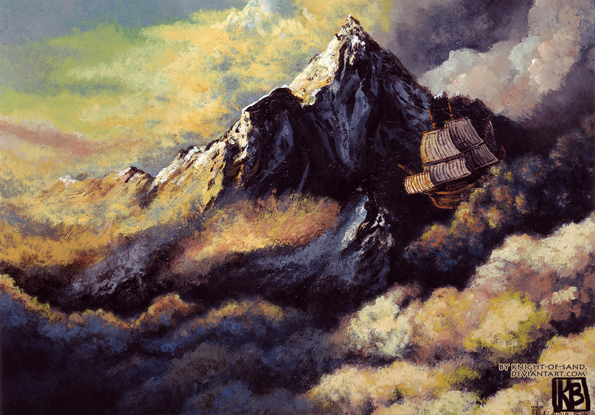
Dreaming about going to mountains...
klaudiabezak.tumblr.com/
www.facebook.com/Klaudia-Bezak…
Made with:
 acrylics,
watercolour paper,
klaudiabezak.tumblr.com/
www.facebook.com/Klaudia-Bezak…
Made with:
Image size
1200x838px 1.91 MB
© 2016 - 2024 knight-of-sand
Comments34
Join the community to add your comment. Already a deviant? Log In
I believe that, in another critique, I mentioned how much I would have liked to see crisper line work. I think, with this image, you've definitely fit the bill. My god, man, this is gorgeous.
Granted, the composition of this image doesn't really require crisp line work. The nature of clouds is to be fuzzy, so it doesn't take too much to make them "seem" sharp, at least. the same can be said for mountains. That is to say, the only thing on really needs to worry about when drawing sharp mountains is the silhouette and the major ridges(and even then, not really too much with the ridges.)
But enough about the line art. Let's talk about light and shadow. You've got lots of very lit up regions next to lots of much darker regions of the image. Excellent, as contrast is a feast to the eye, and you've got it here in spades. I think, however, that you may have missed an opportunity to really make this image pop beyond the max.
What I mean by this is to add another dimension of contrast to the light and dark regions of the image. In the image as it stands, all of your light and dark regions are, more or less, about the same size. It would crank up the visual field of play much further to also include smaller regions of light and shadow within the larger regions.
The trick here, however, is not to have these smaller regions in general be of lesser darkness or lesser light than the big regions of light and dark. Rather, the shadowy regions should be broken up by smaller patches of light, and these patches should be JUST AS BRIGHT as the large, lit up regions.
The same principle applies with the light regions. You might consider breaking them up with smaller patches of shadow, and make those patches just as dark as the your large, shadowy regions.
As far as vision and originality go, I'm just gonna say absolutely above the fold. Yes, yes, yes, and YES! You knew what you were going for, and you went for it. Both of those categories get 5 stars.
I'll be giving you 4 stars for impact, because I feel like this image is just ripe for really cranking up the play between light and dark. I never give 5 stars on a category when I feel like that category could have been approached at an even higher level. This is to say nothing about the actual level you've done here, which probably is by itself a 5 star impact level, but I digress.
Having said all that, I want to talk about technique, and in particular, that flying ship. It may have been that case that you got carried away with the everything else in the drawing, and therefore neglected to pay the utmost attention to that flying ship. I feel like, had you been drawing a very large image of the ship from a straight on and below angle, you would have gotten everything perfect.
As it stands, however, the ship is not in the proper perspective. The sails are not aligned correctly, and as a result, it clearly doesn't "look" right. Again, it is very easy to for the eye to understand what is going on here, an an imperfectly drawn ship is by no means a requirement here. A good ship isn't the point of this image, and so the viewer will be lenient.
But remember how I said that the composition of this image doesn't really require precise line work? Well, ships, being man made, definitely require it. To have gotten that ship drawn in the correct perspective, with precise line work, and with accurate and precise detail, you would absolutely have to be one of the top masters in the industry.
I know your skill level, and you ARE absurdly good, but you're not that good. I'm thus giving you 4 stars for the Technique category, for two reasons:
1. I want to encourage you, as I think you can get to that level.
2. Being one of the top masters of an industry is about as close to maxing out one's skill level as it gets. Since giving 5 stars is equivalent to maxing out the rating and esteem granted for a category, it seems appropriate enough.
Further, the Technique category should always be one of those categories that one should hesitate before giving 5 stars on. Mastery of technique is by far the most difficult to achieve out of the 4 categories given. I thus tend to weight it more heavily than the others. <img src="e.deviantart.net/emoticons/b/b…" width="15" height="15" alt="